Scroll to Top Button (HTML and CSS Only)
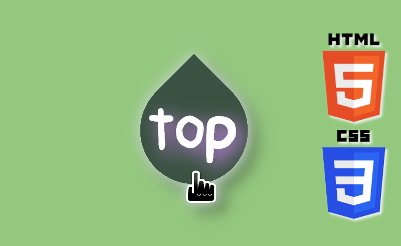
We want to share how we made the 'scroll to top button' on our website. It is super simple and requires only HTML and CSS to do the job.
- only HTML and CSS
- fixed position on page
- hover colour change
- text shadow fallback
- smooth page scrolling
about this button...
Video Tutorial
You can also watch this video on YouTube.
HTML
        <body>
          <header>
            <div id="scrolltop"></div>
          </header>
          <footer>
            <a href="#scrolltop">
              <div class="scroll-arrow"></div>
              <div id="scroll-text">top</div>
            </a>
          </footer>
        </body>
CSS
        /*teardrop shape styling*/
        .scroll-arrow {
          position: fixed;
          left: 26px;
          bottom: 26px;
          width: 36px;
          height: 36px;
          background: rgba(0, 0, 0, 0.66);
          border-radius: 50% 0 50% 50%;
          transform: rotate(-45deg);
          z-index: 9;
        }

        /*text styling*/
        #scroll-text{
          color: white;
          position: fixed;
          left: 30px;
          bottom: 33px;
          font-size: 19px;
          z-index: 10;
          text-shadow: 2px 2px 10px purple;
          font-family: Arial, sans-serif;
          font-weight: bold;
        }
        #scroll-text:hover {
          color: lightgreen;
        }

        /*for smooth scrolling*/
        html {
          scroll-behavior: smooth;
        }
The steps
- in the
footer, create adivwith theclass="scroll-arrow" - style the class to the shape and colour you want (we recommend making it slightly transluscent)
- set
z-indexto 9 - use
position: fixedto place it in a location you prefer - in the
footer, create anotherdivwith theclass="scroll-text" - style the class with a contrasting colour,
font-familyof choice (this is important! as different fonts have different spacing, size etc. which will mess up the positioning),text-shadow(similar colour to the shape, for fallback) - set
z-indexto 10 - use
position: fixedto place it on top of the shape - give it a
:hovercolor if you want - in the
header, add adivwithid="scrolltop"as the anchor - in the
footer, wrap the twodivin a<a href="#scrolltop">. Now the button should work! - for a better viewing experience, style
htmlwithscroll-behavior: smooth
THE END
BTW, the teardrop shape was inspired by a CSS Battle challange! It is a fun game to improve your CSS skills by replicating images and shapes. Definitely go check it out!